Notsonippy’s Weblog

Icon

Just another WordPress.com weblog

Because Studio

BecausePosters

lws_2_because

I was sent a link to these brilliantly clever posters from Because Studio by Zoe at Conversation Pieces. They have a portfolio full of gorgeous print work. I adore this stationery for Low Winter Sun.

Filed under: Corporate Identity, Graphic Design, Stationery, , , , , ,

Regretsy

leopardpants

Slightly far removed from my normal posts but you have to see this brilliant blog celebrating the not-so-wonderful handmade items for sale on Etsy. I have to get me a pair of these leopard velvet flare pants.

Filed under: For fun, , , ,

David Rager

noce11-2

MLT-v2

It was these wedding invitations on Scout Holiday that first took me to David Rager’s portfolio site. He has some really amazing work on there which shows a diverse range of styles. I love his posters for NYU.

Filed under: Graphic Design, Portfolio, , , , , , , ,

Vanishing Wall

Wall vanishes 2

Wall vanishes 1

Before and after shots of the living room in a converted East Village brownstone. Architect Bill Peterson designed it so the main wall could slide away like a garage door to create a kind of balcony. Nicked from New York magazine.

Filed under: Architecture, , , , , , , , , ,

Japanese typographic town logos

flag_13 Kanoya Pink Tentacle

flag_31 Rishiri Pink Tentacle

These are Japanese town logos – “official symbols designed to communicate the identity of each municipality” – nicked from a post on Pink Tentacle – a great site with loads of information on Japanese visual culture.

Each logo cleverly incorporates typography and visual elements of the towns they represent. I love that you get a full explanation of the concept behind them.

I’ve posted a couple of my favourites here.

The red, yellow and blue logo represents Kanoya. “The blue shape represents the Osumi peninsula, and the red circle with the gold katakana カノヤ (Kanoya) represents the city.”

The red and green logo is Rishiri. “Rishiri’s symbol is said to incorporate the hiragana り (ri), which representing ocean waves, along with the hiragana し (shi), which represents Mt. Rishiri.”

Filed under: Graphic Design, Logo design, , , , , , , ,

Life NK packaging

LifeNK-BOBDesignThis packaging for Space NK’s new range of “skin-friendly, eco-conscious essentials” – Life NK – caught my eye from the shop window. It was created by BOB Design who (if I have the right agency) don’t seem to have any work on their website. I hate it when you can’t see a portfolio.

Filed under: Graphic Design, packaging, , , , , ,

LAPD Studio

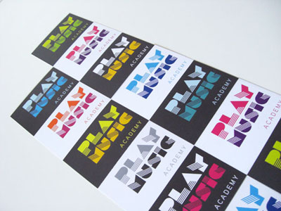
14_play-music-pic-2_LAPDStudio

I love this brand identity LAPD Studio created for Play Music Academy.

Filed under: Corporate Identity, Graphic Design, Logo design, , ,

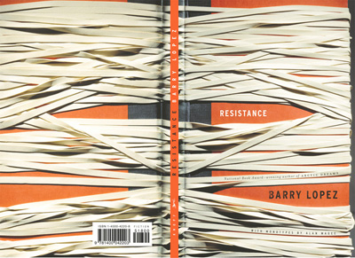
Resistance

GabrielleWilsonA really clever piece of graphic design on this book cover from Gabrielle Wilson.

Filed under: Book Design, Graphic Design, , ,